A brand’s logo is its most important design element because it visually represents the company and its values. The colors in your logo have a serious impact on how people perceive your brand. Research shows people make subconscious judgments about a person, place or product within 90 seconds. Up to 90% of this assessment is based on palette alone. Your logo could make or break a prospect’s decision to become a customer.
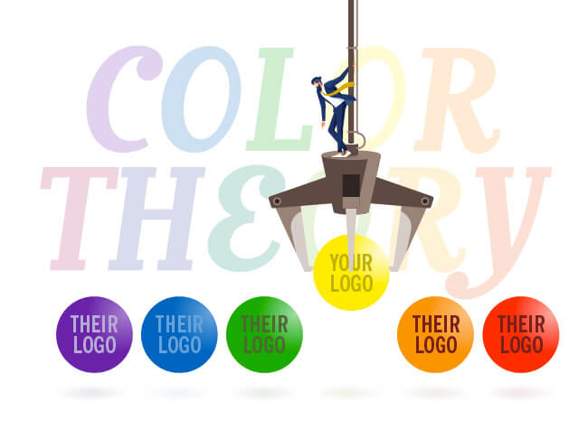
Have no fear! Color theory is here!
Whether we realize it or not, we associate certain fonts, colors and designs with attributes like product quality and reliability. Color theory is a collection of guidelines designers use to communicate those qualities. Sir Isaac Newton introduced color theory when he invented the color wheel in 1666.
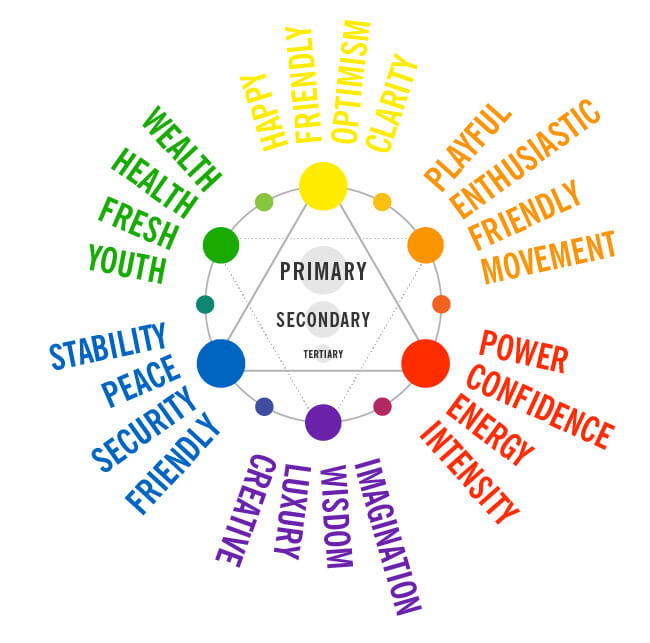
Ultimately, your logo colors must reflect your brand’s personality. Generally speaking, red conveys power, confidence, energy and intensity. Orange is playful and enthusiastic. Yellow expresses happy and friendly. Green? Youth, freshness, health and wealth. Blue says serenity, stability and security. Purple means imagination, wisdom and luxury. Pink equals femininity, warmth and sweetness. And finally, black—elegant, serious and exclusive. Most logos combine colors, with one dominant over the others, each contributing a unique attribute.
Put it all together and, ta-da!
We created these logos for Naples Pickleball Center to establish their reputation as the pickleball capital of the world and tell everyone how fun and exciting pickleball is!
Our intrepid creative director Ryan Hall reveals the rationale behind the design. “Out of the many options we presented, this logo was chosen because of its bold dynamic lettering indicative of sports. The pickleball and palm icons add a sense of motion and place since Naples is the brand’s hometown.”
![]()
Regarding colors, Ryan speaks to brand personality attributes: bold, fun, energetic and approachable, since people of all ages and skill levels can play pickleball. “We gravitated to a dark purple for universal appeal. It’s equally masculine and feminine. Purple is also respected and royal in nature. So, it distinguishes pickleball from the palette of international sports and places pickleball harmoniously among them. Orange adds a fun, playful quality. Lastly, we added accent colors—green (the traditional color of pickleball) and yellow for a pop of warmth. We’re in sunny Florida after all!”
Credit: YourStory.com
Look at your logo with a color expert’s eye.
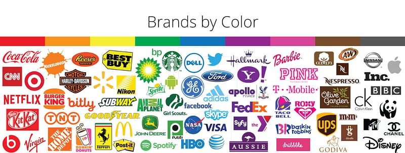
There’s a reason why logos are the colors they are. Numerous fast-food logos frequently have red in them because red triggers appetite and urgency. Amazon’s logo has its name in black (established) with an orange smile (approachable). Both Best Buy and Hertz want to be your friend with bold yellow. Whole Foods and Starbucks go green to remind you they’re environmentally conscious. American Express, Chase, Ford and GE tell the world they’re solid, stable and reliable with blue. Hallmark’s purple imbues a little magic. Baskin Robbins and Dunkin’ splash on pink to give us sweet thoughts. Chanel and Gucci only need black to communicate understated elegance.
What do your logo’s design, typeface and (most importantly) color say about your brand? If the answer isn’t true to its values and personality, get in touch. Let’s create a colorful logo you and your customers (current and future) can’t resist!