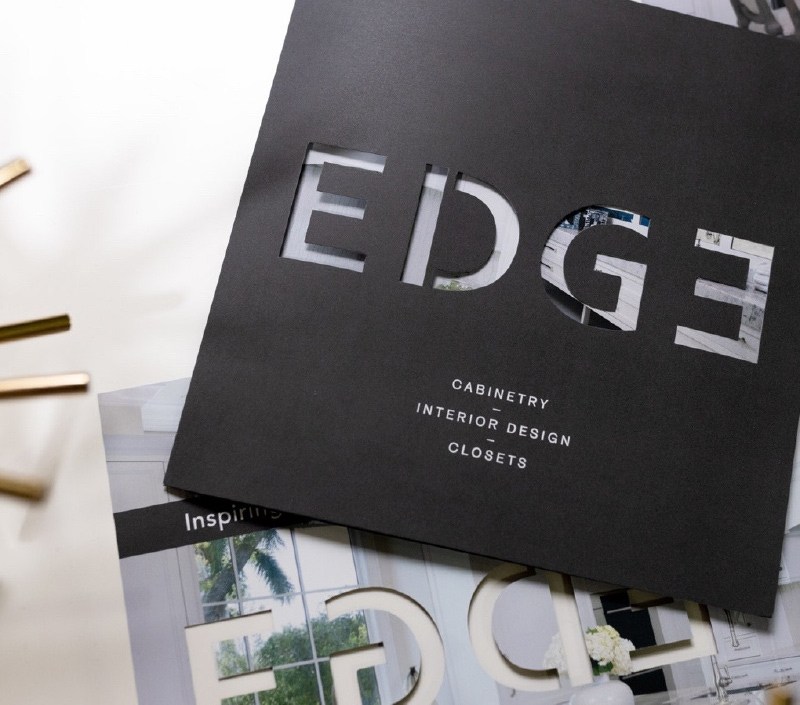
We’re pros at maximizing the power of print
Yes, we live in a digital world. In the 21st century, most searches related to buying decisions begin on the “interweb.” And justifiably so since it allows nearly immediate comparisons among competing products and services. But digital has not killed the influence and impact of “old school” printed pieces such as brochures and direct mailers. In fact, digital communications have only pushed print to survive and thrive despite the lethal threat posed every day by computer servers around the world.
When we produce a printed piece, we brainstorm from every angle. We dig deep to make a series of creative decisions which will keep the final cost within the budget and achieve (or surpass) the desired sales and marketing objectives.
Let’s illustrate what we mean with a real-world brochure we created.
First, we consider the brand and the intended audience.
In this case, a custom interiors boutique with an affluent clientele desiring to expand brand awareness, primarily among luxury home and condominium owners. The demographic targeted to receive this brochure is savvy and discerning. The brand’s aesthetic is minimalist, modern and cutting-edge.
Ultimately, we knew the brochure should be unique in shape (square, rather than standard) and larger than the previous direct mail pieces we wrote and designed—in this case 6.75” by 6.75”. And it should express the brand’s inclination to clean lines and surfaces with sufficient negative space and impressively expansive imagery on every page.

Next, we evaluate materials to produce the desired “experience.”
Print is a very personal medium. After all, you hold a brochure in your hands. Touch each page. Sure, you hold a mobile device too, but experiencing a printed piece is a universe beyond swiping or scrolling on a palm-sized object. Textures and colors drive how readers feel as they absorb a brochure. Here paper conjures a level of interaction and intimacy digital cannot match: tactile influences and the conclusions our brains make because of them. Thickness and “toothiness” of paper convey brand qualities like stability, elegance, rusticity and subtlety. Should the cover be delicate or sturdy? Should interior pages be solid or translucent? Smooth or fibrous?
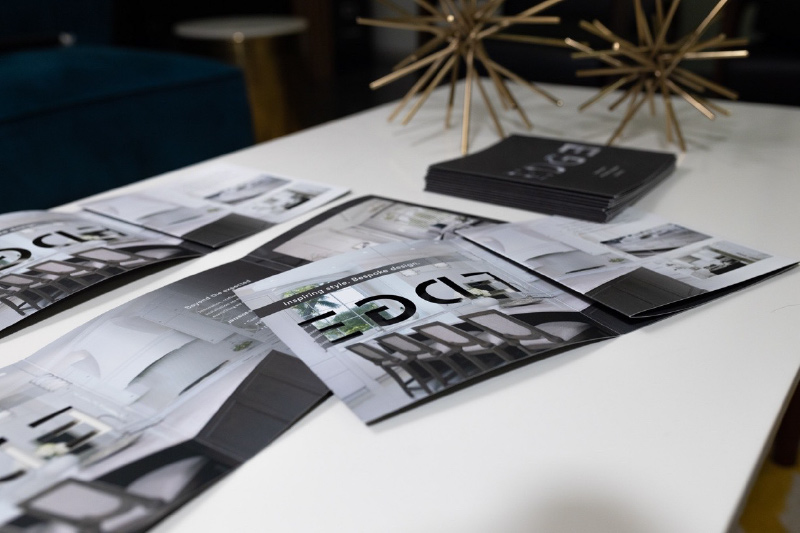
In keeping with the essence of the brand, the paper we chose has a soft-touch coating, not unlike polished hardwood, marble or other exquisite surface material in a home enhanced by our clients. And speaking of coatings—
Let’s not forget die-cuts, embossing, inks and varnishes.
After all, we don’t want the brochure to smudge or feel… inadequate. All these elements speak to the brand’s integrity and image. They add to production costs, but can pay for themselves in results. Think of them as special effects. How memorable are the glow and sound of a Jedi light sabre activating? They have immeasurably more impact than flashlights attached to colored plastic tubes.
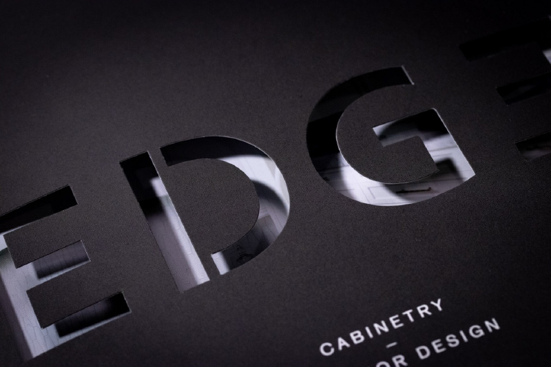
If special effects can be utilized and the budget accommodates them, the brand will benefit. In our case, the dramatic die-cuts on the cover allow breathtaking photography inside to peek through. Without a copy narrative, those die-cuts say “bespoke craftsmanship and artistry.”
And as for colors and editorial style decisions, read our blog posts on color theory and brand vocabulary for a deeper understanding on how they contribute to achieving a printed piece’s objectives.
And finally, we ask ourselves, “are we impressed by it?”
We want the piece to dazzle its audience. So it has to dazzle us first. The size. The shape. The photography. The copy. The paper. The binding. Does it reinforce the brand? The precision and finesse of how our brochure is cut, folded, bound and finished had to meet the same impossibly high standards as our clients’ services and products.
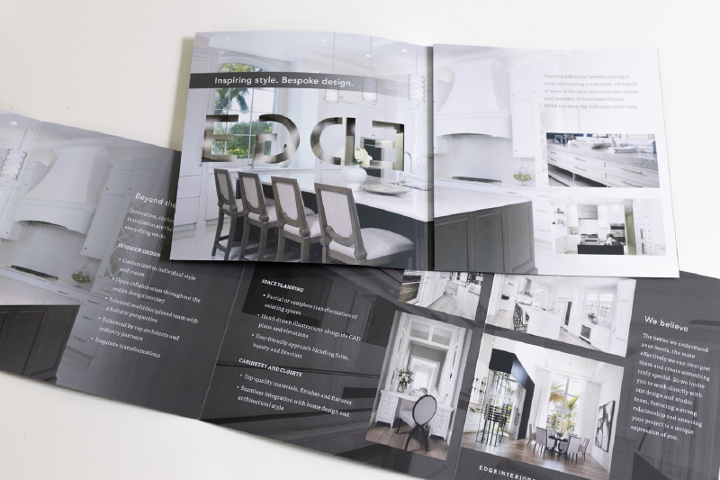
Unlike the digital realm, print has permanence. It outlives websites, banner ads, social media posts and blogs like this one. Years from now, a brochure’s looks and relevance may be diminished by time. But its very existence in its original form is undeniable.
Digital communications are dynamic and compelling. But they do not (and will not ever) extinguish the persuasive power of a printed work designed, written and constructed with the brand’s intrinsic qualities in mind.


Leave a comment: